
Why User-Friendly Web Design is Your Competitive Advantage
User friendly web design is the foundation of every successful website today. Research shows it takes just 50 milliseconds for visitors to form an opinion about your site—that’s faster than a blink. In today’s competitive digital landscape, if your website doesn’t immediately communicate clarity, purpose, and ease of use, visitors will simply go elsewhere.
Quick Answer: Essential Elements of User-Friendly Web Design
- Visual Hierarchy & Minimalist Layout – Guide users’ eyes to what matters most
- Intuitive Navigation – Help visitors find what they need in 3 clicks or less
- Mobile-First Responsive Design – Work flawlessly on every device
- Fast Page Speed – Load in 1-3 seconds to prevent bounce
- Clear Calls to Action – Tell users exactly what to do next
- Accessible Design – Ensure everyone can use your site
- Readable Content – Use scannable text with headings and white space
- Consistent Branding – Maintain familiar patterns throughout
The stakes couldn’t be higher. Studies reveal that 61.5% of users abandon websites due to poor navigation, while 34.6% leave because of bad content structure. Your website is often the first point of contact between your brand and potential customers—it must work perfectly.
The good news? Creating a user-friendly website doesn’t require a massive budget or complex technical skills. Modern low-code tools have made it easier than ever to implement proven design principles that keep visitors engaged and guide them toward conversion.
Whether you’re building sites for clients or creating your own business presence, understanding these core principles will set you apart from competitors who still treat web design as purely aesthetic. A truly user-friendly website blends beautiful design with practical functionality—it’s both a science and an art.
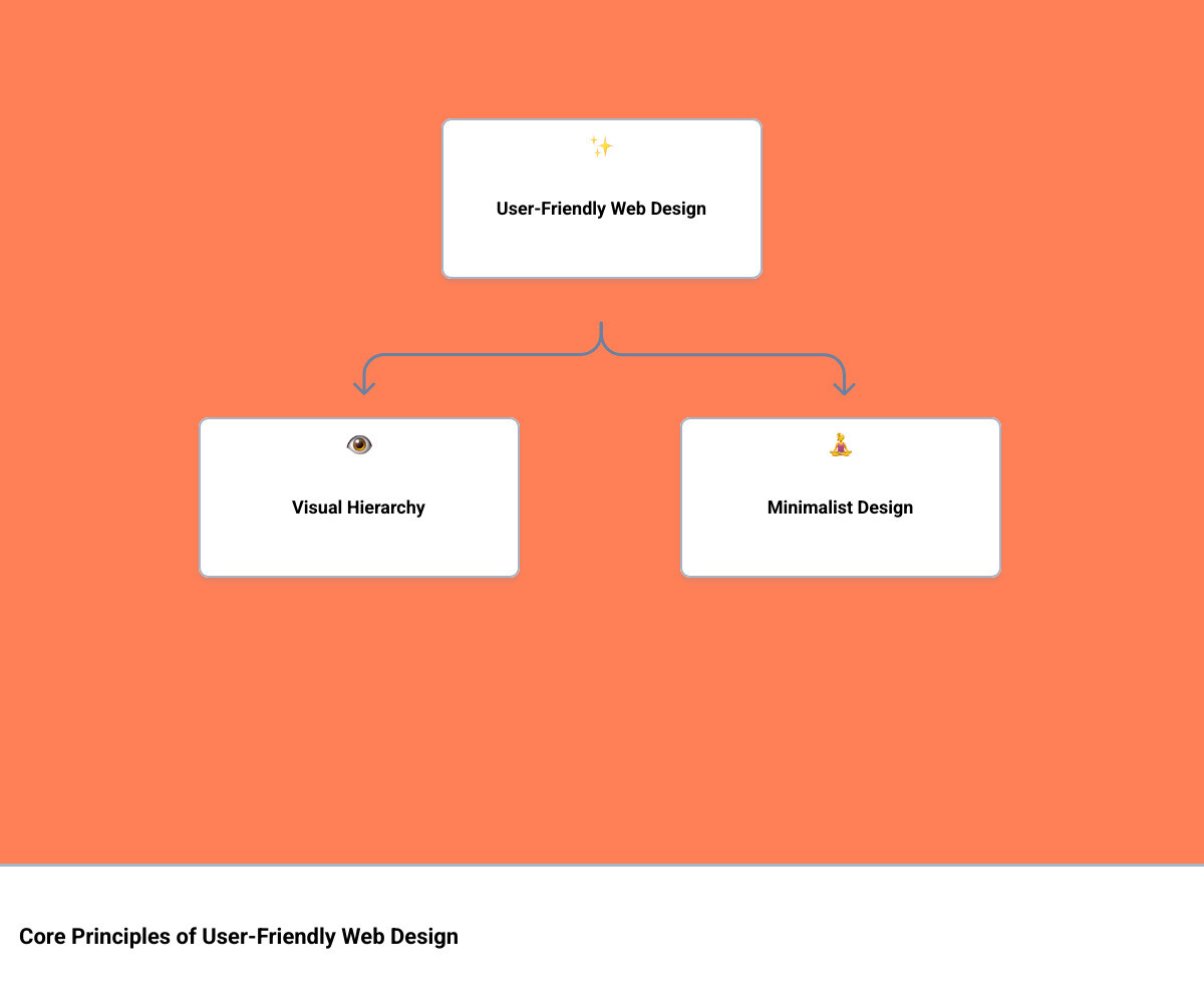
1. Master Visual Hierarchy & Minimalist Design
Imagine walking into a room. Your eyes naturally gravitate towards certain elements first—perhaps a brightly lit painting, a large window, or a person speaking loudly. This is visual hierarchy in action, and it’s just as crucial in user friendly web design. We use it to guide our visitors’ attention, ensuring they see what’s most important and don’t feel overwhelmed. Coupled with minimalist design, we can create an experience that’s both intuitive and delightful.
Our goal is to make sure our visitors don’t have to think too hard. According to Hick’s Law, too many choices lead to decision paralysis. By carefully arranging our content and simplifying our layout, we reduce cognitive load, making the user journey smoother and more enjoyable. After all, nobody wants to decipher a puzzle just to find basic information!
Prioritize Key Information with Visual Hierarchy
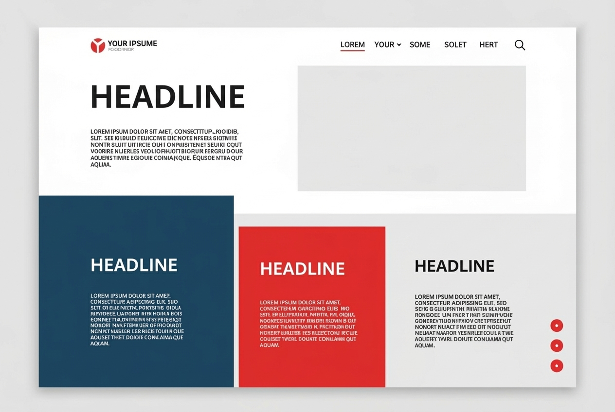
Visual hierarchy is the practice of making the most important parts of our site the most noticeable. This involves using elements like size, color, contrast, spacing, and placement to direct the user’s eye. For instance, a large, boldly colored headline will naturally capture attention before smaller body text. A brightly colored Call to Action (CTA) button stands out against a muted background, practically begging to be clicked.
Eye-tracking research shows that people often scan web pages in specific patterns, like the F-shaped pattern or the Z-pattern. The F-shaped pattern, for example, means users read horizontally across the top, then down a bit and across a shorter section, and finally scan vertically down the left side. By understanding these patterns, we can strategically place our most critical content and CTAs where they’re most likely to be seen.
If we want users to sign up for a free trial, we’ll make that “Sign Up” button visually distinct and place it prominently. This deliberate guidance is vital because, as we’ve seen, a significant 34.6% of participants in a GoodFirms survey listed poor content structure as the top reason for leaving a website. A clear visual hierarchy prevents this frustration by leading users to what they need, quickly and efficiently.
Improve Focus with Minimalist Design
Minimalist design is about stripping away the unnecessary to improve focus and usability. Think of it as decluttering a room – suddenly, the essential pieces shine. In web design, this means generous use of white space (or negative space), which isn’t just empty space; it’s a powerful tool that improves readability and reduces visual clutter. It gives elements room to breathe, making our content easier to process.
A clean, uncluttered design is the cornerstone of a truly user friendly web design. It reduces distractions, allowing visitors to concentrate on our core messaging or Calls to Action. This streamlined approach also contributes to faster loading times, which, as we’ll discuss later, is critical for user satisfaction. When we remove superfluous elements, we’re not just making our site look good; we’re making it work better.
For those looking to build websites that are both aesthetically pleasing and highly functional, embracing minimalist principles can be a game-changer. It’s about designing with intention, ensuring every element serves a purpose. To dive deeper into creating websites that truly stand out with intentional design, explore More info about Custom Designed Business Websites.
2. Build Intuitive Navigation & Site Structure for User-Friendly Web Design
Our website’s navigation isn’t just a menu at the top of the page; it’s the backbone of the user experience. Imagine navigating a maze with no clear signs or a map – that’s what a poorly designed website feels like. We want our visitors to feel like they’re on a well-paved road, confidently moving from one point to another without getting lost or frustrated. This is why intuitive navigation and a logical site structure are paramount for any user friendly web design.
The stakes are high: 61.5% of users list poor navigation as the main reason for leaving a site. This statistic alone should underscore the importance of getting our navigation right. If users are unsure how to get around, they’ll simply leave and look elsewhere. Our goal is to make sure our visitors can reach any page they desire from any other page on our site with minimal effort.
Key Principles for User-Friendly Web Design in Navigation
To ensure our navigation is a guiding light rather than a confusing labyrinth, we adhere to several key principles:
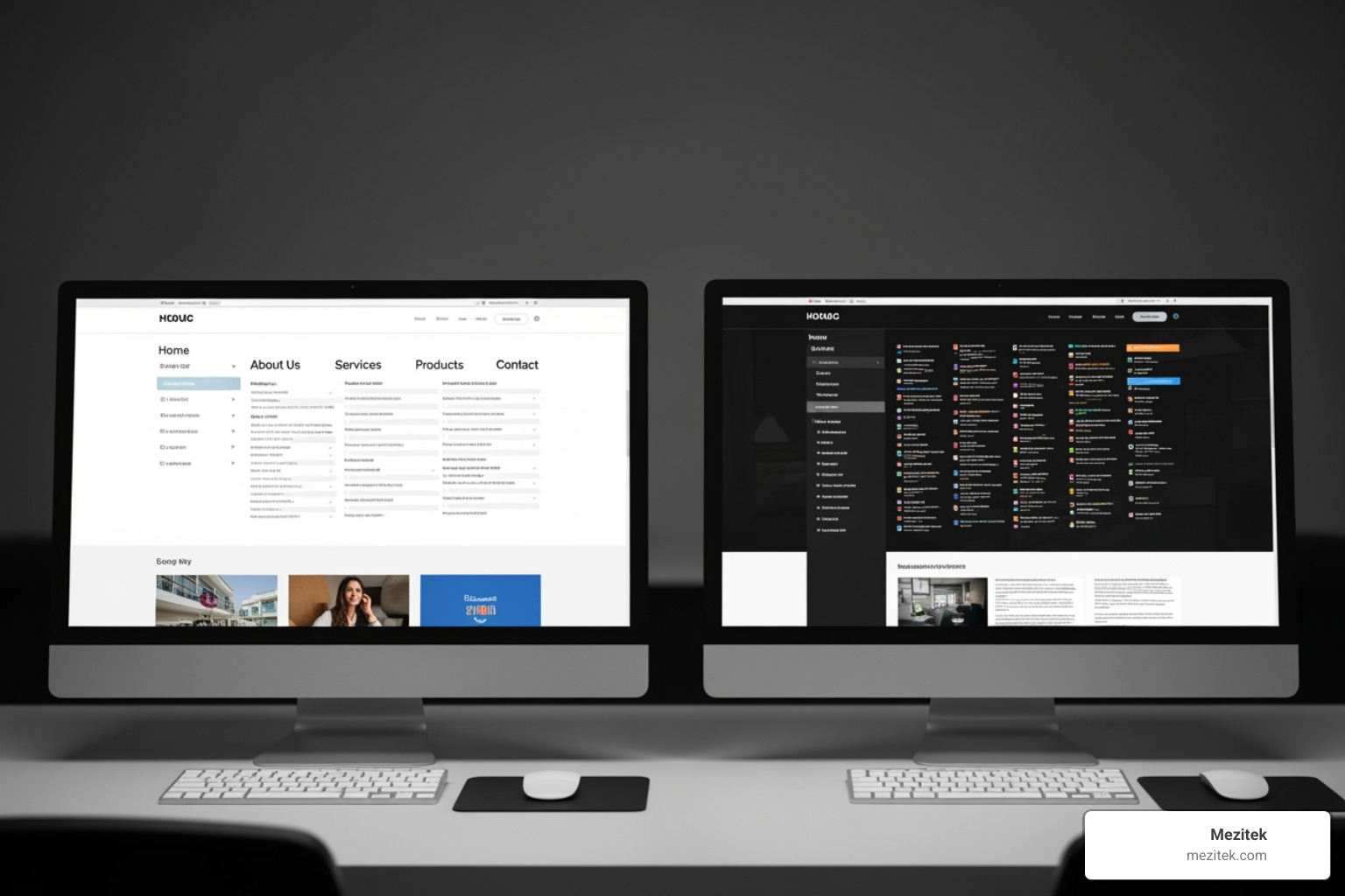
- Simplify Your Menu Structure: While it might be tempting to display every single link, overloading menus can easily overwhelm users. We generally aim for a simple menu, ideally with no more than seven top-level items. If we have a lot of content, we can use sub-menus or dropdowns to organize additional links without cluttering the main navigation.
- Use Descriptive Labels: Don’t get too creative with menu labels. “About Us” or “Contact” are far more effective than ambiguous terms like “Our Journey” or “Reach Out.” Users should instantly understand what to expect when they click a link.
- Prioritize Mobile Navigation: With a growing number of people browsing on mobile devices, our navigation must work flawlessly on smaller screens. This often means using a “hamburger menu” (the three horizontal lines) that expands into a full menu when tapped. We ensure touch targets are large enough for easy tapping.
- Footer Navigation: While the header menu is for primary navigation, the footer is an excellent place for secondary links like privacy policies, terms of service, or career pages. It helps keep the main menu clean.
- Search Bar Functionality: No matter how well-organized our menu is, some users prefer searching directly for information. Including a prominent search bar, especially on content-heavy sites, is a must for a truly user friendly web design.
- Breadcrumbs: These are secondary navigation features that help visitors keep track of their location within the site. They typically appear at the top of a page, showing the path back to the homepage (e.g., Home > Products > Category). They’re incredibly useful for user orientation and even for SEO. For more insights on how a Content Management System (CMS) can help manage your site’s structure and navigation, check out What is a CMS (Content Management Systems) Explained.
Create a Logical Site Structure
Beyond just the navigation menu, the overall site structure plays a pivotal role in user-friendliness and search engine optimization. We think of it as building the skeleton of our website, ensuring everything is logically connected.
- Sitemaps (HTML vs. XML): We typically create two types of sitemaps. An HTML sitemap is for our human visitors, providing an organized, hierarchical list of all our site’s pages. An XML sitemap, on the other hand, is for search engines, helping them crawl and index our content more efficiently. This dual approach ensures both users and search engines can understand our site’s architecture.
- Logical Flow: Our site should have a clear, logical flow, guiding users from general topics to more specific details. This structure should align with user expectations, making it easy for them to predict where information might reside.
- Content Categories: Organizing content into clear, distinct categories makes our site easier to browse and understand. This also prevents our navigation from becoming an endless list of links.
- User Expectations: Adhering to common web conventions (Jakob’s Law) helps reduce cognitive load. Users spend most of their time on other sites, so they expect our site to work similarly. This familiarity makes our site instantly more intuitive.
For a deeper dive into how breadcrumbs can improve both user experience and SEO, we recommend reading Breadcrumbs for SEO. A well-structured navigation system is intuitive, follows consistent patterns, has a logical flow, and is consistent with user expectations. It truly makes a website a user experience dream. To learn more about how to design and implement these crucial architectural elements, check out Best Practices for Website Architecture.
3. Prioritize Mobile-First & Responsive Design
There’s a good chance that you’re reading this on a mobile device right now. This simple fact underscores why prioritizing mobile-first and responsive design isn’t just a trend; it’s a fundamental requirement for any user friendly web design. Our digital lives increasingly revolve around smartphones and tablets, making a seamless experience across all devices non-negotiable.
Google recognized this shift years ago, boosting mobile-friendly websites in its search rankings. If our website isn’t optimized for mobile, we’re not only frustrating a significant portion of our audience but also hurting our visibility in search results. A website that looks great and functions perfectly on a desktop but crumbles on a phone is simply not fit for purpose in today’s digital landscape.
Adopt a ‘Mobile-First’ Strategy
A ‘mobile-first’ strategy means we design for the smallest screen first, then progressively improve the experience for larger screens. This approach forces us to prioritize content and functionality, stripping away non-essentials and focusing on what truly matters to the user. When we design for mobile first, we’re building a solid foundation that ensures our core message and functionality are always accessible.
Consider touch targets – buttons and links need to be large enough and spaced appropriately for fingers, not just mouse pointers. We also think about mobile user behavior: people often browse on the go, seeking quick answers and easy interactions. Our design choices reflect these needs, ensuring a streamlined and efficient experience. This strategy ensures that even if a user is quickly checking our site on a tiny smartwatch screen, they still get a functional and pleasant experience.
To further explore how we approach modern web design, including mobile optimization, we invite you to check out More info about our Web Design services.
Ensure a Seamless Experience with Responsive Design
Responsive design is the technical implementation that brings our mobile-first vision to life. It’s about building a website that fluidly adapts to various screen sizes and orientations, from a small smartphone to a large desktop monitor. This isn’t about creating separate versions of our site; it’s about a single site that intelligently responds to its environment.
Key techniques we use include:
- Fluid Grids: Instead of fixed pixel widths, we use relative units (percentages or viewport units) for layout elements. This allows our content containers to scale smoothly.
- Flexible Images: Images are often the heaviest elements on a page. We ensure our images automatically resize and optimize themselves to fit their container, preventing horizontal scrolling or slow loading on smaller screens.
- CSS Media Queries: These powerful CSS rules allow us to apply different styles based on device characteristics, such as screen width, height, or orientation. This means we can change layouts, font sizes, and even hide or show elements depending on the device.
The result is a consistent and frustration-free experience for our visitors, regardless of how they access our site. Responsive design enables visitors to steer our website easily and interact without frustration, ensuring that our user friendly web design truly lives up to its name across all devices.
4. Optimize for Performance & Accessibility
In the digital world, patience is a virtue few possess. Our visitors expect speed, and they expect our websites to work for everyone, regardless of ability. This is why optimizing for page speed and ensuring accessibility are not just good practices; they are critical pillars of any truly user friendly web design. If our site is slow or inaccessible, even the most beautiful design won’t save it from abandonment.
Boost Satisfaction with Lightning-Fast Page Speed
The internet moves fast, and so should our websites. A website that takes a long time to load can irritate visitors and lead to lowered engagement. In fact, Google’s research revealed that the probability of a user bouncing increases by 32% as page load time goes from one to three seconds. That’s a huge jump for just two seconds! Our goal is to ensure our website loads in 1 to 3 seconds for optimal usability.
To achieve this lightning-fast performance, we focus on several key areas:
- Image Optimization: Large, unoptimized images are often the biggest culprits for slow page speeds. We compress images, choose appropriate file formats (like WebP), and implement lazy loading (where images only load when they come into the viewport).
- Browser Caching: We leverage browser caching to store parts of our website (like CSS files and images) on a user’s device after their first visit. This makes subsequent visits much faster.
- Minifying Code: We remove unnecessary characters (like white space and comments) from our HTML, CSS, and JavaScript files without affecting functionality, making them smaller and quicker to download.
The impact of page speed extends beyond just user satisfaction; it’s also a significant SEO ranking factor. Search engines prioritize fast-loading sites, so optimizing performance helps us climb the search results and reach more potential visitors. For more detailed insights into why page load time is so critical, we encourage you to explore Google research on page load time.
Make Your Site Accessible to Everyone
User-friendliness and accessibility are often discussed separately, but we believe they are inextricably linked. A website cannot be truly user-friendly if it’s not accessible to everyone. Accessibility means designing and developing websites so that people with disabilities can interact with them in a meaningful and equivalent way. This includes users with visual, auditory, motor, or cognitive impairments.
While not the same, the two concepts are so closely tied that a website cannot be user-friendly without being accessible, and vice versa. Accessibility features often improve usability for all users. For example, clear headings and good color contrast benefit everyone, not just those with visual impairments.
We adhere to the Web Content Accessibility Guidelines (WCAG), which provide a comprehensive set of recommendations for making web content more accessible. Key practices include:
- Alt Text for Images: Providing descriptive “alt text” for images ensures that screen readers can convey the image’s content to visually impaired users.
- Color Contrast: Ensuring sufficient contrast between text and background colors is vital for readability, especially for users with low vision or color blindness.
- Keyboard Navigation: Not all users rely on a mouse. We ensure our websites can be fully steerd using only a keyboard, which is essential for users with motor impairments or those using screen readers.
- Screen Reader Compatibility: We structure our content semantically, use proper HTML elements, and provide clear labels for forms and interactive elements so that screen readers can interpret and vocalize our content accurately.
Being mindful of accessibility isn’t just a matter of good design; in many regions, it’s a legal requirement. More importantly, it’s about inclusivity, ensuring that our digital spaces are welcoming and usable for the widest possible audience. To learn more about designing for accessibility, visit Designing for Web Accessibility.
Frequently Asked Questions about User-Friendly Websites
We often encounter common questions about what makes a website truly user-friendly. Here, we address some of the most frequent inquiries to help clarify these essential concepts.
What are the core principles of user-friendly web design?
At its heart, user friendly web design revolves around a set of foundational principles that prioritize the visitor’s experience. These include:
- Clarity and Simplicity: Our website’s purpose and content should be immediately understandable, free from clutter and unnecessary jargon.
- Consistency: We maintain uniform design elements (fonts, colors, layouts) and navigation patterns across all pages, creating a predictable and familiar experience.
- Intuitive Navigation: Visitors should be able to find what they need quickly and easily, without having to think about where to go next.
- Fast Performance: Our site must load quickly, ideally within 1-3 seconds, to prevent frustration and high bounce rates.
- Accessibility: We ensure our website is usable by everyone, including individuals with disabilities, by adhering to standards like WCAG.
- Mobile-Friendliness: Our site must adapt seamlessly to all devices, offering a consistent and optimal experience whether on a desktop, tablet, or smartphone.
These principles work in harmony to create a website that not only looks good but also functions exceptionally well for every user.
How can I test if my website is user-friendly?
Building a user friendly web design is an ongoing process, and testing is crucial to ensure it meets our visitors’ needs. We use a variety of methods to gauge and optimize user-friendliness:
- A/B Testing: We compare two versions of a page or element (e.g., different CTA button colors or navigation layouts) to see which performs better in terms of user engagement and conversions.
- Website Analytics: Tools like Google Analytics provide invaluable data on user behavior, including bounce rates, time on page, pages per session, and conversion rates. High bounce rates or short visit durations can indicate usability issues.
- Heatmaps: These visual tools show us where users click, move their mouse, and scroll on our pages. They reveal hot spots of interaction and areas that might be ignored.
- User Feedback Surveys: Directly asking our visitors about their experience through on-site surveys or feedback forms can uncover pain points we might not have noticed.
- Usability Testing: This involves observing real users as they attempt to complete tasks on our website. Their struggles and successes provide direct insights into what’s working and what isn’t.
By regularly employing these testing methods, we can continuously refine our website and ensure it remains a user experience dream.
What is the difference between UX and UI design?
While often used interchangeably, UX and UI design refer to distinct but interconnected aspects of user friendly web design:
- UX (User Experience) Design: This encompasses the entire journey a user has with our product or website. It’s about how a user feels about the interaction—is it easy, efficient, enjoyable, frustrating? UX designers focus on understanding user needs, conducting research, mapping user flows, and ensuring the overall usability and satisfaction. Think of it as the architecture of a house: how easy is it to move through, does it meet your needs, does it feel good to be there?
- UI (User Interface) Design: This focuses on the visual and interactive elements of our website or product. It’s about what the user sees and interacts with—buttons, icons, typography, color schemes, images, and layout. UI designers are concerned with the aesthetics and visual presentation, ensuring the interface is appealing, consistent, and easy to use. Continuing the house analogy, UI is the interior design: the paint colors, furniture, lighting, and decor.
UX design is about the overall feel and functionality, while UI design is about the visual layout and interactive elements. Both are crucial for a truly user friendly web design, working together to create a cohesive and delightful experience.
Conclusion
Creating a user friendly web design is no longer just an option; it’s a strategic imperative for success in today’s digital world. From making a strong first impression in just 50 milliseconds to guiding users seamlessly through your content, every element contributes to the overall user experience. We’ve explored how mastering visual hierarchy and minimalist design can focus attention, how intuitive navigation and a logical site structure prevent frustration, and why prioritizing mobile-first and responsive design is essential for reaching every visitor. Furthermore, we’ve highlighted the non-negotiable importance of lightning-fast page speed and inclusive accessibility for all users.
By embracing these principles, low-code freelancers and small business owners can build websites that not only look professional but also perform exceptionally well. A user friendly web design drives conversions, builds trust, and ultimately positions your brand for sustainable growth. It’s about turning casual visitors into loyal customers by making their online journey as smooth and pleasant as possible.
Don’t let your website be a missed opportunity. Invest in user-centric design, and watch your online presence transform into a true asset. To further improve your web design knowledge and build outstanding digital experiences, we invite you to Explore our Web Design resources.