Why High-Converting Website Examples Matter
High converting website examples show us what works when it comes to turning visitors into customers, subscribers, or leads. Here are the top strategies these websites consistently use:
Key Elements of High-Converting Websites:
- Clear value proposition – Visitors understand what you offer in seconds
- Strong calls-to-action (CTAs) – Prominent buttons with action-oriented copy
- Social proof – Testimonials, reviews, and trust badges
- Fast load times – Pages that load in under 3 seconds
- Mobile-first design – Seamless experience on all devices
- Simple navigation – Easy to find information and take action
Let’s be honest: most websites aren’t converting as well as they could be.
The average landing page conversion rate across industries is just 2.35%, according to WordStream. That means for every 100 visitors, only 2-3 actually take action. The top 25% of landing pages convert at 5.31% or higher – more than double the average.
This isn’t just about design aesthetics. A 1% increase in conversion rate can mean serious money. Imagine you get 10,000 monthly visitors with an average order value of $100. Going from 2% to 3% conversion means jumping from $20,000 to $30,000 in monthly revenue. That’s an extra $120,000 per year without spending a dime more on traffic.
The good news? You don’t need to guess what works. By studying websites that are already converting at high rates, you can borrow proven strategies and apply them to your own projects.
We’ll break down real examples of high-converting websites across different industries. You’ll see exactly what makes them effective and learn practical tactics you can implement today.
The Anatomy of a High-Converting Website
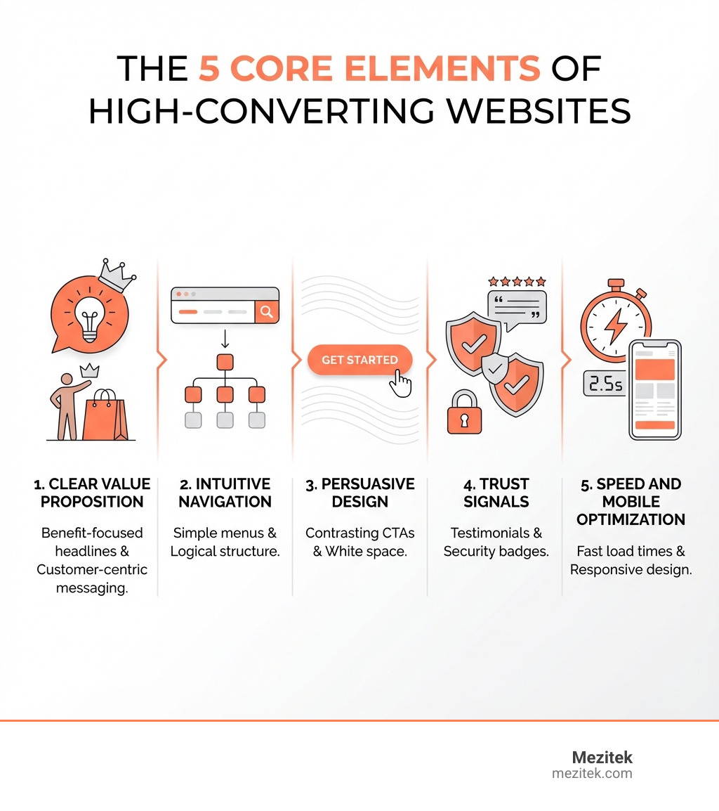
What separates a high-converting website from the rest? It’s a combination of strategic design, clear communication, and a deep understanding of user behavior. High converting website examples consistently demonstrate these core elements. They aren’t just pretty faces; they are carefully crafted to guide visitors towards a desired action, making the journey as effortless and compelling as possible.
These sites attract users with a clean, visually appealing design, clearly communicate their purpose, and provide noticeable calls-to-action (CTAs) that guide visitors toward conversion. They load quickly, use responsive frameworks for mobile users, and feature intuitive navigation so people can easily find the information they need. Effective design focuses on fast page speed, well-placed white space, and eye-catching yet cohesive elements such as images, graphics, or infographics.
Clear Value Proposition and Messaging
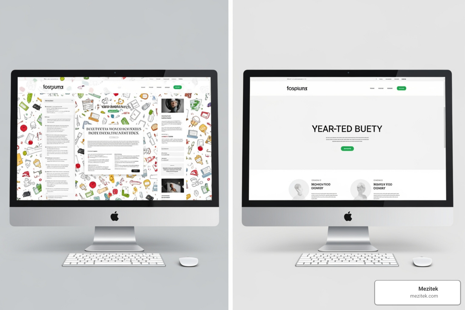
One of the first things a high-converting website nails is its value proposition. Visitors arriving on your site, whether from an ad, a search engine, or a social media post, are asking one crucial question: “What’s in it for me?” Your website needs to answer this immediately and unequivocally.
Clear value propositions help visitors understand what your company offers and how it differs from competitors. This means crafting benefit-oriented headlines and customer-centric copy that speaks directly to your audience’s needs and pain points. The message should be so straightforward that a visitor can grasp your core offering within seconds, making it immediately understandable and appealing.
Intuitive UX and Seamless Navigation
A beautiful website is useless if people can’t find what they’re looking for. High-converting websites prioritize user experience (UX) with seamless navigation. This involves mapping out the user journey, ensuring simple menus, a logical site structure, and effective search functionality. The goal is to reduce friction at every step, making it easy for visitors to explore, learn, and ultimately take action.
For example, a clean, uncluttered dashboard providing an overview of spending or income instantly creates an anxiety-free experience. Intuitive navigation is crucial for users to find information easily, whether through well-structured category pages, clear course thumbnails, or minimalist menus. As we’ve discussed before, understanding Best Practices for Website Architecture is fundamental to achieving this.
Persuasive Design and Compelling CTAs
Design isn’t just about aesthetics; it’s a powerful tool for persuasion. High-converting websites leverage visual hierarchy, ample white space, and strategic color contrast to draw attention to key elements. Eye-catching graphics and engaging animations can also charm an audience and communicate complex ideas quickly.
However, the real magic happens with Calls-to-Action (CTAs). These are the guiding lights for your visitors. Prominent, color-contrasting CTA buttons that stand out against the page’s background are essential. They should use action-oriented copy (“Sign Up Free,” “Shop Now,” “Learn More”) and be strategically placed where users are most likely to act. The best CTAs answer the user’s question: “What’s in it for me?”
Beyond clear buttons, psychological triggers play a significant role. Scarcity (“Only 3 left in stock”), urgency (“Offer ends today”), and reciprocity (free trials or resources) are powerful motivators. These triggers encourage faster decision-making by tapping into our innate fear of missing out (FOMO) or our desire to reciprocate a gesture. Setting an expiry date on a call to action, for instance, can provide that final push a visitor needs.
Building Trust with Social Proof
In the online world, trust is currency. Visitors are more likely to convert if they believe others have had positive experiences with your business. That’s why high-converting websites are masters at building credibility through social proof and trust signals.
This includes prominently displaying customer testimonials, case studies, and positive ratings and reviews. Security badges (especially for e-commerce sites) and recognizable partner logos also reassure prospects that your business is legitimate and reliable. For instance, highlighting that a product has been named an Editor’s Choice by PCMag gives visitors a strong reason to feel confident. Customer reviews, particularly those with user-submitted images or videos, build significant trust because they offer unbiased perspectives. Even small touches, like showing company logos of clients you’ve worked with, can act as powerful trust signals.
The Need for Speed: Performance and Mobile-First Design
In our digital world, patience is a virtue few online shoppers possess. Page load speed directly impacts conversion rates. According to a Digital.com survey, a staggering 53% of online shoppers expect e-commerce pages to load in three seconds or less, and 50% will abandon their shopping cart if pages take too long to load. If your site is sluggish, you’re literally leaving money on the table.
Beyond speed, mobile responsiveness is non-negotiable. Mobile devices account for approximately 55% to 60% of global internet traffic. By 2017, mobile had become the dominant source of web traffic worldwide at 50.3%, a segment that expanded to 52.2% in the following year. More recently, the 2024 Conversion Benchmark Report found that 83% of all landing page visits happen on mobile devices. Ignoring the mobile user experience is no longer an option. A responsive design ensures your website looks good and functions perfectly on any device, providing a seamless experience for all users. Optimizing your website’s performance starts with choosing the right foundation, and learning How to Choose a Host for Your Website is a critical first step.
7 High Converting Website Examples and What We Can Learn
Now that we’ve covered the theoretical “why,” let’s dive into the practical “how” by examining some real-world high converting website examples. These sites showcase conversion-focused design in action, offering valuable lessons for anyone looking to boost their online performance.
Example 1: The Personal Finance App (Mint)
Mint, the money management app, is a prime example of turning a potentially anxiety-inducing topic into an anxiety-free user experience.
What we learn:
- Simplicity and Clarity: Mint’s neat web design brings simplicity to personal finance. Its clean, uncluttered dashboard provides an overview of spending, income, and financial health at a glance, making complex data easy to digest.
- Trust-Building Design: Plenty of white space and sleek infographics contribute to an approachable feel.
- Clear, Color-Contrasting CTAs: Mint clearly explains its budgeting and credit-score features while featuring prominent, color-contrasting CTA buttons like “Sign Up Free” that stand out and guide users to take action. They guide users with a simple sign-up process and clear value propositions.
Example 2: The Online Learning Platform (Skillshare & edX)
Online learning platforms like Skillshare and edX excel at converting visitors into students by showcasing value and simplifying the enrollment process.
What we learn:
- Strong Value Proposition: Skillshare instantly highlights fun, creative classes and promotes project-based learning for practical skill development. edX simplifies its pitch, making benefits crystal clear by using bullet points to explain what learners will gain.
- Easy Sign-Up Process: Skillshare’s dark blue and white color scheme helps mint green CTA buttons (“Browse Classes,” “Get Started With 2 Months Free”) stand out, encouraging visitors to explore or sign up for unlimited access to thousands of classes.
- Engaging Course Previews & User Reviews: Both platforms use engaging visuals, clear descriptions, and user reviews to build trust and entice prospective learners.
Example 3: The Niche eCommerce Store (Rookwood & Gloverall)
Rookwood Pottery and Gloverall outerwear demonstrate how niche e-commerce brands can captivate audiences and drive sales through rich visuals and detailed product information.
What we learn:
- Storytelling & High-Quality Visuals: Rookwood’s site features beautiful and eye-catching images of their wares, reflecting brand heritage through sophisticated typography and muted tones. They tell rich stories about their products, including historical inspiration and artistic techniques, accompanied by close-up, high-resolution images.
- Detailed Product Descriptions & Easy Catalog Navigation: Rookwood provides detailed product descriptions (dimensions, materials, glaze details) and easy-to-use navigation to explore products. Gloverall, for its part, includes a handy pop-up fit and sizing guide that even notes if a product is designed to be oversized, addressing common online shopping concerns for clothing.
- Trust Signals: Rookwood blends artisan storytelling with trust signals, like showcasing artist profiles and the pottery-making process, making visitors feel connected to the brand.
Example 4: The B2B SaaS Tool
Many B2B SaaS companies effectively convert visitors by focusing on solving specific business problems and building immediate credibility.
What we learn:
- Problem-Solution Focus: High-converting B2B sites often lead with headlines that speak directly to a pain point or desired outcome, like “PR Software Built for How You Work” or “Grow faster and work smarter.” They frame their offering as a solution, not just a product.
- Prominent Social Proof: Trust signals, such as logos of recognizable client companies positioned below the main headline, instantly build credibility. Customer-centric messaging and statistics like “237,000+ customers” further promise value and solutions.
- Personalized CTAs & Lead Generation Forms: They use clear calls to action like “See what’s wrong with your website” which act as compelling lead magnets. Simple, easy-to-complete forms are strategically placed to capture interest without overwhelming the user.
Example 5: The Direct-to-Consumer (DTC) Brand (Warby Parker & Xbox)
DTC brands like Warby Parker and Xbox excel at reducing purchase uncertainty and making the buying process enjoyable and straightforward.
What we learn:
- Virtual Try-On & Reduced Uncertainty: Warby Parker leads with straightforward language and bold CTAs, offering a “Try at Home for Free” option and a “Take the Quiz” CTA. This guides users towards engagement and significantly reduces the perceived risk of purchasing eyewear online.
- Simplified Checkout: They focus on making the entire process, from selection to checkout, as simple as possible with clear pricing and easy access to information.
- Strong, Clear CTAs: Xbox provides an excellent example of how to design a CTA button. The electric green color makes the button pop, with no distracting clutter around it, clearly indicating the next step. High-quality product photography complements the design.
Example 6: The Service Booking Website (TyresOnTheDrive & Simply Business)
Websites offering services, especially those requiring bookings or quotes, convert well when they prioritize clarity and simplicity.
What we learn:
- Clarity & Upfront Value: TyresOnTheDrive immediately conveys its value proposition in the headline: “Expert Tyre Fitting At Your Home or Work.” This instantly communicates the unique differentiator – convenience – and is backed up by social proof.
- Simple Forms: A quick home page form makes it easy for users to get started. Simply Business, dealing with the complex product of insurance, makes it feel simple with a clear headline and easy instructions, introducing a multi-step form only after the initial hurdle.
- Social Proof with Ratings: Testimonials and positive reviews reinforce the service’s reliability and quality, building trust from the outset.
What Makes These High Converting Website Examples So Effective?
These high converting website examples aren’t successful by accident. They all share common threads that form the foundation of their high conversion rates. The key takeaways and best practices we can distill from them revolve around a user-centric approach, data-driven design, and continuous improvement.
- User-Centric Design: Every element, from navigation to copy, is designed with the visitor in mind. They focus on answering user questions, addressing pain points, and making the user journey intuitive and enjoyable.
- Clear Value Proposition & Messaging: They articulate what they offer and why it matters in a concise, compelling way.
- Compelling & Visible CTAs: Calls to action are irresistible, visually prominent, and tell users exactly what to do next.
- Trust & Credibility: Social proof, security features, and transparent communication build confidence.
- Performance & Mobile-First: Fast load times and flawless mobile experiences ensure no visitor is lost due to technical issues.
- Psychological Triggers: They subtly employ urgency, scarcity, and reciprocity to encourage action.
Building a website that truly converts isn’t a one-time task; it’s an ongoing process of refinement. For those looking to build or improve their online presence, understanding these principles is paramount. Learn more about the fundamentals of creating a strong online presence in our guide on How to Build a Website.
How to Measure and Optimize for Higher Conversions
Once your website is live, the work of conversion optimization truly begins. We can’t just set it and forget it! High-converting websites are the result of continuous measurement, analysis, and iteration.
Setting Up Analytics and Tracking Goals
The first step to optimizing anything is to measure it. To calculate your website conversion rate, we use a simple formula: (Number of Conversions / Total Visitors) x 100. For example, if you have 200 conversions from 10,000 visitors, your conversion rate is 2%.
Tools like Google Analytics are indispensable here. We use them to track key metrics such as conversion rate, bounce rate, and average session duration. More importantly, we set up specific conversion goals within these tools (whether it’s a purchase, a form submission, or a newsletter signup). This allows us to see exactly where visitors are converting and where they might be dropping off. As we’ve learned, it’s crucial to Leverage Analytics for Continuous Improvement, tracking performance, analyzing user behavior, and using that data to optimize pages over time. The more you learn, the better you can iterate and keep boosting your conversion rates.
The Power of A/B Testing and Personalization
Even the most successful websites can be improved. This is where A/B testing and personalization come into play.
A/B testing involves creating two or more versions of a page element (like a headline, CTA button, or layout) and showing them to different segments of your audience to see which performs better. If you ignore A/B testing, you’re missing gold. For example, one brand saw a 15% increase in conversion rate, leading to an additional $2.5 million in revenue, simply by optimizing elements through A/B testing. This systematic approach allows us to make data-driven decisions rather than relying on guesswork.
Personalization takes optimization a step further. It means tailoring the website experience for different user segments based on factors like their location, referral source, device, or past behavior. This involves customized headlines, CTAs, or even dynamic landing pages for specific campaigns and relevant offers. Personalization makes visitors feel like the site is speaking directly to them, making them more likely to convert. For low-code freelancers and small business owners, leveraging Best AI Tools for Web Designers can help streamline the process of creating personalized experiences and optimizing pages without extensive coding knowledge.
Frequently Asked Questions about High-Converting Websites
What is a good website conversion rate?
Defining a “good” conversion rate can be tricky because it varies significantly by industry, business model, and the specific goal of the page. However, we have some benchmarks.
- The average landing page conversion rate across industries is only 2.35%, but the top 25% convert at rates of 5.31% or higher.
- The average conversion rate across all industries is often cited around 2.9%.
- For landing pages specifically, the average is closer to 6.6%.
- E-commerce landing pages typically see an average of 4.2%, while travel and hospitality are around 4.8%. Entertainment landing pages, interestingly, can soar to 12.3% on average.
- A 2022 survey of over 3,000 stores found the average conversion rate is 1.3%, with top 20% of stores achieving over 3.2%, and the top 10% exceeding 4.8%.
So, while 2-3% might be average, aiming for 5% or higher is a strong goal, and top performers can even hit 10% or more. Context truly matters here.
What are the most common conversion-killing mistakes on a website?
We’ve seen it all, and some mistakes consistently sabotage conversion efforts:
- Slow Page Speed: As we mentioned, 53% of online shoppers expect pages to load in under three seconds. If your site is slower, half of your potential customers might abandon it before they even see your offer.
- Confusing Navigation & Cluttered Layouts: If visitors can’t easily find what they’re looking for or are overwhelmed by too much information and too many options, they’ll leave. A messy design distracts from the main message.
- Weak or Unclear Value Proposition: If visitors don’t understand what you offer or how it benefits them within seconds, they won’t stick around.
- Lack of Trust Signals: No testimonials, reviews, security badges, or recognizable logos can make visitors hesitant to engage or purchase.
- Not Mobile-Friendly: With most web traffic coming from mobile devices, ignoring mobile optimization means alienating the majority of your audience.
- Unclear or Missing CTAs: If visitors don’t know what action to take next, or if the CTA is hard to find or understand, they won’t convert.
- Asking for Too Much Information: Especially in lead generation forms, asking for excessive details upfront creates friction and can drive users away.
How do psychological triggers like urgency increase conversions?
Psychological triggers are powerful tools that tap into human nature to encourage action. High converting website examples use these subtly but effectively:
- Scarcity (“Only 3 left!”): This trigger plays on our fear of missing out (FOMO). If an item is limited, we perceive it as more valuable and are more likely to act quickly.
- Urgency (“Offer ends today!”): Similar to scarcity, urgency creates a time-sensitive pressure. Countdown timers or limited-time discounts (“Offer ends in 24 hours”) motivate immediate decisions. Setting an expiry date on a call to action can be incredibly effective.
- Reciprocity (Free Resources/Trials): When you give something of value first (like a free trial, a helpful guide, or a bonus), people feel a natural inclination to give back or reciprocate. This builds goodwill and encourages them to take the next step, like signing up for a paid plan.
- Social Proof (“20,000+ users love this!”): This isn’t just about building trust; it’s about conformity. If many others are doing something, we assume it’s the right choice. This is why testimonials, reviews, and showing the number of satisfied customers are so impactful.
- Loss Aversion: People are generally more motivated to avoid a loss than to achieve an equivalent gain. Framing an offer in terms of what they might miss out on can be a strong motivator.
These triggers, when used ethically and genuinely, can significantly influence visitor action and boost your conversion rates.
Turn Your Website Into a Conversion Machine
We’ve explored what defines a high-converting website, dissected numerous high converting website examples, and dug into the metrics and psychology behind their success. The overarching lesson is clear: building a website that truly drives results is about putting the user first, designing with purpose, and continuously refining your efforts.
For low-code freelancers and small business owners, this means focusing on:
- Clarity and Value: Ensure your unique value proposition is instantly understood.
- Seamless Experience: Prioritize intuitive navigation, fast loading speeds, and mobile responsiveness.
- Trust and Persuasion: Integrate social proof and compelling CTAs, using psychological triggers thoughtfully.
- Measure and Optimize: Continuously track performance, A/B test variations, and personalize experiences based on data.
Your website is your always-on salesperson. By applying these best practices, you can transform it from a passive online presence into a powerful conversion machine.
Ready to dive deeper into making your website a conversion powerhouse? Explore our resources and Learn more about Web Design to build attractive, user-focused sites that guide visitors confidently toward becoming customers.